Media Studies - Evaluation Questions
Cy Robinson
1.
The genre of our music video choice was sort of unique; firstly it was by a band named iglu & hartly, rock band, two lead singers, drummer, keyboard player etc. But the genre was slightly different as it had a hip-hop/drum&bass vocal approach which changed it from a standard rock band into something else, we managed to capture this, especially in our video as we showed the generic features of a down to earth, socially “unacceptable” teenager through our use of costumes and attitude from the main singers, and contrasted this back to the typical view of a band by conforming when performing on stage in the video (suits, ties, instruments).
Our media packet does have some common features of actual media packets especially in accordance with a band/duo – two lead singers. A common convention of a digipack for this sort of band is to use a lot of pictures empowering the main members, displaying significant characteristics, in our case showing two main singers and having them interact with one another, through chemistry, this allows the viewers to be brought into a sense of security and attracts them initially if not further. You could say the digipack does not challenge directly the conventions of media products due to its simplicity in complexity; however this can be interpreted as a challenging concept as it is not so much of conformity.
2.
In both our media products the combination of texts is suited to the bands image. This was done through firstly the actual font of the text used; it was nothing too special, simple in accordance to the simplicity and not being too complex which can distort what actually needs to be done. The colour of the text too is a consistant vibrant/neon pink and black again shows relation to the band, people are comfortable with relations, either making the viewer more likely to look into the band. The title in our actual video and even the track list for our digipack is in neon pink.
3.
From our audience feedback I have learnt that it is important to not allow the viewers to become bored. As humans it is in our nature that we are able to become bored very easily, keeping a variety in shots, editing techniques and locations is very important, the viewer must feel like they are being grabbed or communicated too through the use of the video, this will grab their attention and should not let go of it. As our choice of song was a fast paced song and performed by a band, a live performance was a must, this allows a crescendo of video footage, building up to the performance. The feedback received about the performance was very complimentary, I think it helped that we did build up to it, and saved it for the one of the last scenes, it does give a sudden change to everything included in the mise en scene of the video. I also learnt that relative shots are definitely a big factor in making a good video, although there are videos that exist that are very abstract and not to relative to the song, however in this genre of music it is definitely a good thing. Our rough-cut feedback did have a few comments about some of the editing in a bad way, e.g. that they had spotted the camera in some of the shots, this was positive criticism as it helped afterwards when we managed to sort these problems out and resulted in a much better video. I don’t think there wasn’t anything that we didn’t end up improving on (all that was said in our feedback) which then now would mean that our viewers should be completely satisfied with the final cut of our music video.
4.
The use of new technology has helped a great deal in making all this possible. Firstly the use of the actual DV cameras, if it wasn’t for the cameras the footage for the videos would not have been able to of been made. Also the use of the internet was a big help, using the internet to research pre-existing music videos helped us with the inspiration needed in order to create our music video. Again on the internet there is the use of blogs, which has not been around relatively long. This has helped with being able to share with everyone exactly what we have been doing and how, whether it be sharing what has inspired us by posting YouTube videos onto our blog, or showing people our rough cut which leads to feedback and then to final cut which is an improvement based on viewers feedback. Final Cut Express is the software we used on the computers in order to edit our captured footage, again if it wasn’t for this piece of software our music video would not exist, it allowed us to specifically create a music video to our likings and to fine tune anything we did not like. All our editing was done on Final Cut Express. Also another editing program used, mainly for our digipack was Photoshop, although we could have used a simple program such as “Paint” Photoshop allowed us to create more complexity within our digipack and advert. There’s a lot more of effects and ability within the software, not restricting us to certain editing techniques. Also on Photoshop we edited still photographs taken from a digital camera (another piece of technology which aided us in production). The digital camera helped our digipack and advert as we used the pictures from the camera rather than perhaps screen shooting from our video clip, using a still photograph allows higher quality and is a lot more efficient.

Fred Foster, evaluation
Media Studies Product Evaluation
In what ways does your media product use, develop or challenge forms and conventions of real media products?
The generic conventions of a music video are very different to a film, for example. In our music video there are elements of a live performance, which is not something that is possible to replicate in the genre of film. A music video is not only for the viewers’ entertainment, it is also an effective promotional tool for an artist. A memorable music video can boost the artists’ reputation and make the brand more identifiable. It is easy for a lot of people to see the video, thanks to music channels on television and You Tube. Unlike in the film genre, a music video sells a single and is a valuable marketing device, helping artists and band managers to develop the brand of the group or artist by continuing motifs and trademarks.
I think that if you were to look at our media product as a whole, you would not be able to call it stereotypical, but you wouldn’t be able to call it non-conformist either. Judging by the Mise-en-Scene of our video, the costumes are quite generic for hip-hop artists. This was always our aim. The shades, tracksuits and jewellery successfully conform to our chosen genre. On the other hand, our locations that we used in the video are quite dissimilar to what you would normally expect from a video of this nature, as they are not hip-hop stereotypes (Locations such as forests, gardens etc.). This is the non-conformist element to our product. We balanced this with the live performance component which was far more generic and mainstream to the genre. We worked very hard to ensure that there were lots of repeated motifs (Pink shades, Iglu&Hartly logo, and pink and black colour theme) in both our video and in the ancillary texts. We were sure to include them in both the video and ancillary texts.
How effective is the combination of your main product and ancillary texts?
I think that the ancillary texts are a good addition to the feature music video. One of the many advantages of producing ancillary texts was that it gave is the chance to develop and continue motifs that featured in our feature video. These motifs include pictures of the artists on location in the filming of our video. Motifs are good because it helps the public identify the group and make them a more recognizable label. The use of colour in our ancillary texts is very consistent and the fonts of writing are familiar. By continual use of the Pink and Black colour theme we are building an identity for the band and boosting its publicity. It is a very good marketing technique. It could be said that the digipack represents the group quite stereotypically. It is a simplistic, minimalist piece of work, which suggests that the artists are lazy, or devote their time to the music side of things. The continuous Pink and Black theme stays true to the memorable trademark image we are trying to build.
What have you learnt from your audience feedback?
Throughout our whole project we used a blogging website called Blogger to post information and plans associated with our project. Other groups and teachers posted regular feedback on our rough cut, final cut and ancillary texts. The most useful feedback was the Teacher feedback on our rough cut, as we were able to improve in the areas Tanya suggested. As she is a teacher we felt her opinions were most valuable, with it being quite likely that she knows what is required for a good mark! Thanks to this feedback we were able to get more close ups of performers faces, cut back and forth to different locations and get more shots with graffiti background (as this fitted the genre) edited in to our video for the Final Cut. The feedback told us what people liked and what they disagreed with in our feature video. We were then able to make changes consequently. We were a bit confused with some of the feed back because at times it was contradictory to its own views. The peer review told us overall that the cinematography and the Mise-en-Scene. One thing that was correctly highlighted was the lack of relation between visuals and lyrics, which forms part of Goodwin’s music video analysis model. However, this lack of relationship between lyrics and videos was something which did not prove to be an issue with our project, because this was a style that we wanted to convey.
How did you use new media technologies in the construction and research, planning and evaluation stages?
We used our online blog to post any information for our project, to update our progress regularly, post examples of work and show our planning. Our peers and our teachers frequently post reviews of our work on our blog. It is an efficient way of keeping all of our work in one place and making it easy to access. We edited our video using Final Cut Express, which was shot on camcorder. We are lucky because Final Cut is state of the art video editing software, which allows us to put lots of professional and advanced effects and features to our music video. Thanks to Final Cut we have been able to use fades, transitions, colour tints, ghosting and glow effects. To design our ancillary products, we used gatefold cover design templates with programme called Photoshop, which allowed us to have absolute freedom in what we wanted to do. With using Photoshop there are a very wide range of options, tools and effects to choose from, as the software is so versatile.
We used You Tube to import videos on to our blog for analysis. We also uploaded our rough cut and final cut to You Tube, so that others could see it. We used iTunes, to import our song (Jump out of Your Car- Iglu & Hartly) in to Final Cut so that we could do lip-syncing professionally. We did this very well, I think. Through using Blogger we earned a prestigious accolade “Blog of the week”. It’s a competition held throughout all media studies groups. It was recognition of the whole group’s enthusiasm for the tasks set. Modern technology has definitely helped bring amateur film making to a more accessible audience. This helps the industry as there is more enthusiasm for it as a whole.
In what ways does your media product use, develop or challenge forms and conventions of real media products?
The generic conventions of a music video are very different to a film, for example. In our music video there are elements of a live performance, which is not something that is possible to replicate in the genre of film. A music video is not only for the viewers’ entertainment, it is also an effective promotional tool for an artist. A memorable music video can boost the artists’ reputation and make the brand more identifiable. It is easy for a lot of people to see the video, thanks to music channels on television and You Tube. Unlike in the film genre, a music video sells a single and is a valuable marketing device, helping artists and band managers to develop the brand of the group or artist by continuing motifs and trademarks.
I think that if you were to look at our media product as a whole, you would not be able to call it stereotypical, but you wouldn’t be able to call it non-conformist either. Judging by the Mise-en-Scene of our video, the costumes are quite generic for hip-hop artists. This was always our aim. The shades, tracksuits and jewellery successfully conform to our chosen genre. On the other hand, our locations that we used in the video are quite dissimilar to what you would normally expect from a video of this nature, as they are not hip-hop stereotypes (Locations such as forests, gardens etc.). This is the non-conformist element to our product. We balanced this with the live performance component which was far more generic and mainstream to the genre. We worked very hard to ensure that there were lots of repeated motifs (Pink shades, Iglu&Hartly logo, and pink and black colour theme) in both our video and in the ancillary texts. We were sure to include them in both the video and ancillary texts.
How effective is the combination of your main product and ancillary texts?
I think that the ancillary texts are a good addition to the feature music video. One of the many advantages of producing ancillary texts was that it gave is the chance to develop and continue motifs that featured in our feature video. These motifs include pictures of the artists on location in the filming of our video. Motifs are good because it helps the public identify the group and make them a more recognizable label. The use of colour in our ancillary texts is very consistent and the fonts of writing are familiar. By continual use of the Pink and Black colour theme we are building an identity for the band and boosting its publicity. It is a very good marketing technique. It could be said that the digipack represents the group quite stereotypically. It is a simplistic, minimalist piece of work, which suggests that the artists are lazy, or devote their time to the music side of things. The continuous Pink and Black theme stays true to the memorable trademark image we are trying to build.
What have you learnt from your audience feedback?
Throughout our whole project we used a blogging website called Blogger to post information and plans associated with our project. Other groups and teachers posted regular feedback on our rough cut, final cut and ancillary texts. The most useful feedback was the Teacher feedback on our rough cut, as we were able to improve in the areas Tanya suggested. As she is a teacher we felt her opinions were most valuable, with it being quite likely that she knows what is required for a good mark! Thanks to this feedback we were able to get more close ups of performers faces, cut back and forth to different locations and get more shots with graffiti background (as this fitted the genre) edited in to our video for the Final Cut. The feedback told us what people liked and what they disagreed with in our feature video. We were then able to make changes consequently. We were a bit confused with some of the feed back because at times it was contradictory to its own views. The peer review told us overall that the cinematography and the Mise-en-Scene. One thing that was correctly highlighted was the lack of relation between visuals and lyrics, which forms part of Goodwin’s music video analysis model. However, this lack of relationship between lyrics and videos was something which did not prove to be an issue with our project, because this was a style that we wanted to convey.
How did you use new media technologies in the construction and research, planning and evaluation stages?
We used our online blog to post any information for our project, to update our progress regularly, post examples of work and show our planning. Our peers and our teachers frequently post reviews of our work on our blog. It is an efficient way of keeping all of our work in one place and making it easy to access. We edited our video using Final Cut Express, which was shot on camcorder. We are lucky because Final Cut is state of the art video editing software, which allows us to put lots of professional and advanced effects and features to our music video. Thanks to Final Cut we have been able to use fades, transitions, colour tints, ghosting and glow effects. To design our ancillary products, we used gatefold cover design templates with programme called Photoshop, which allowed us to have absolute freedom in what we wanted to do. With using Photoshop there are a very wide range of options, tools and effects to choose from, as the software is so versatile.
We used You Tube to import videos on to our blog for analysis. We also uploaded our rough cut and final cut to You Tube, so that others could see it. We used iTunes, to import our song (Jump out of Your Car- Iglu & Hartly) in to Final Cut so that we could do lip-syncing professionally. We did this very well, I think. Through using Blogger we earned a prestigious accolade “Blog of the week”. It’s a competition held throughout all media studies groups. It was recognition of the whole group’s enthusiasm for the tasks set. Modern technology has definitely helped bring amateur film making to a more accessible audience. This helps the industry as there is more enthusiasm for it as a whole.
Wednesday, 9 December 2009
Evaluation Writing- Josh Iggulden
There are some general conventions that need to be considered when making a music video. The video should involve a fair amount of lip synching by the artist to show them singing the song. It can also be quite abstract, with different camera angles as well. The video needs to promote the singer and show lots of close ups of them so the audience can see what they look like. In a lot of videos the singer is looking very glamorous and wears expensive clothes to make them seem rich and powerful. The video also needs to sell the song and be relevant to it, and also keep the viewers interest at the same time. These were all conventions for us to consider for our music video.
Our video is quite ‘non conformist’ and challenges the typical forms and conventions of a normal hip hop video, more than it uses them. There are instances where the forms are used, such as the hoodies and tracksuits we wear. This is a typical convention of a hip hop music video and something that you see in most videos in that genre. There are lots of instances where we challenge the typical conventions, such as the locations we used. We used various locations, most of them outdoors, to vary the different shots we took. All of these locations are different to the usual party and club scenes that you would be used to seeing in a hip hop video, such as J-Kwon’s ‘Tipsy’, which we have included in our audio commentary. We also filmed a live performance scene. You sometimes see this in hip hop videos, but they will be wearing tracksuits and hoodies. For example, Eminem has a live performance scene in the videos for ‘Lose Yourself’ and ‘Business’. This is the same as our performance scenes but he sticks to the hip hop conventions and wears a hoody and tracksuit bottoms. We wore suits to make it look a bit retro and go against the usual forms and conventions once again.
Along with the music video we created two ancillary products: the magazine advert and the digipack cover. I think these look really good and the combination of the three together works really well. There are lots of ways we linked the three together. One is the colour scheme of black and pink. This is used for the title at the start of the music video, with the black background and pink text. It is also used on the magazine advert and the digipack cover, which is black with most of the text in pink.
We also used the glasses as one of our main motif. In a lot of the shots for our video we are wearing glasses. We also have the image of the pink glasses on the front of the digipack. This instantly enables our audience to recognise what group it is. Another way that we link the products is the locations that we used to film our video.
Most of these locations have also been used to take the images that were used for the collages inside our digipack. This is another use of a motif that the audience can use to recognise us. Another motif is the wall with the words ‘safe bloofs’ on. This almost became a motto for our group as the location is good and we got some good shots for the video and images for the digipack cover. We also have the ‘iglu & hartly’ logo to link the magazine advert and digipack cover as the same logo has been used on each product, with the same colours as well. This would make it easier for anyone wanting to find the digipack in a shop after seeing the advert. The representation of the band also links the three products together well, as the music video has a very humorous feel. This is what we were aiming for, and have also used that for the images used in the digipack and the magazine advert. The video and images represent the band as very fun loving and funny. We had feedback saying we had a ‘Goldie Lookin’ Chain’ feel to our band. This is because they are a hip hop band who are humorous and don’t stick the normal conventions of hip hop either.
The feedback we received for the ancillary products was good in places, but some of it I didn’t agree with, such as “There could involve more about what it is advertising because if I didn't know it was for a digipack I really wouldn't know what it was”. I don’t agree with this as we wanted to make the advert as simple as possible and give the minimum amount of information with fans still knowing what it is.
The same group said that the front cover was really effective as it is simple. I agree with this. They also said “Really, really don't like the grouping of the pictures though. It makes the pack look amateur doesn't compliment cover”. I agree that the picture grouping could have been a bit better but we wanted the inside to look quite amateur as we have gone with that look for the video and the advert as well.
The same group also gave us feedback on our rough cut but some of it was quite confusing to work out, such as “It’s consistently different which relates to the song” and “The lack of variety makes the audience lose interest; doesn't change pace”. With feedback contradicting itself like this we weren’t able to take anything from it.
The feedback for our rough cut version was better, particularly from our teacher. She gave us constructive comments that we could use to change our video for the better, such as “More close ups of performance. More graffitit (or other) more abstract images to use in edit”. We agreed with all of this feedback and filmed more abstract shots to put in and fit in with the genre of our video. We did, however, disagree with the comment “Some shots rather daft”, as the daft shots gave the video the humorous edge that we wanted.
During the research we used technologies such as ‘youtube’ to watch music videos from the genre of our song and analyse them. This gave us ideas of what to do in our video. We then used a camcorder and a tripod to film. The tripod meant that the camera could be held steady and would not leave a shaky picture. When we had completed our filming we uploaded the film onto ‘final cut’, a programme on the Mac. We used this programme to insert our song from iTunes and then cut and edit our video. We added some different effects such as ‘glow’ and ‘colour tint’ as well. We were unable to add any effects to the last half of the video as we did not have enough time.
When we had finished our final version of the video, it was exported from Final cut and made into a Quicktime video and uploaded to youtube. We then had to produce our two ancillary products. We took lots of images with a stills camera and uploaded them to our Mac. We the created both of the products on ‘Photoshop’, using the templates that were in our group folder. Throughout this whole project we have also been updating our blog using an online programme called ‘blogger’. This is where we put all of our design ideas, roughcut, and any research we did, so other groups could see what we had been getting up to, by viewing our blog from the Long Road Media website. We were also awarded ‘blog of the week’ one week, as a testament to our continued hard work and good ideas.
I think that all of these new technologies have opened up filmmaking or music video making to a wider, amateur audience, as anyone with a video camera and a Mac can film their footage and edit it using Final Cut. I think this is a very good thing as lots of people can create their ideas now, whereas they wouldn’t have been able to before this technology was around.
Our video is quite ‘non conformist’ and challenges the typical forms and conventions of a normal hip hop video, more than it uses them. There are instances where the forms are used, such as the hoodies and tracksuits we wear. This is a typical convention of a hip hop music video and something that you see in most videos in that genre. There are lots of instances where we challenge the typical conventions, such as the locations we used. We used various locations, most of them outdoors, to vary the different shots we took. All of these locations are different to the usual party and club scenes that you would be used to seeing in a hip hop video, such as J-Kwon’s ‘Tipsy’, which we have included in our audio commentary. We also filmed a live performance scene. You sometimes see this in hip hop videos, but they will be wearing tracksuits and hoodies. For example, Eminem has a live performance scene in the videos for ‘Lose Yourself’ and ‘Business’. This is the same as our performance scenes but he sticks to the hip hop conventions and wears a hoody and tracksuit bottoms. We wore suits to make it look a bit retro and go against the usual forms and conventions once again.
Along with the music video we created two ancillary products: the magazine advert and the digipack cover. I think these look really good and the combination of the three together works really well. There are lots of ways we linked the three together. One is the colour scheme of black and pink. This is used for the title at the start of the music video, with the black background and pink text. It is also used on the magazine advert and the digipack cover, which is black with most of the text in pink.
We also used the glasses as one of our main motif. In a lot of the shots for our video we are wearing glasses. We also have the image of the pink glasses on the front of the digipack. This instantly enables our audience to recognise what group it is. Another way that we link the products is the locations that we used to film our video.
Most of these locations have also been used to take the images that were used for the collages inside our digipack. This is another use of a motif that the audience can use to recognise us. Another motif is the wall with the words ‘safe bloofs’ on. This almost became a motto for our group as the location is good and we got some good shots for the video and images for the digipack cover. We also have the ‘iglu & hartly’ logo to link the magazine advert and digipack cover as the same logo has been used on each product, with the same colours as well. This would make it easier for anyone wanting to find the digipack in a shop after seeing the advert. The representation of the band also links the three products together well, as the music video has a very humorous feel. This is what we were aiming for, and have also used that for the images used in the digipack and the magazine advert. The video and images represent the band as very fun loving and funny. We had feedback saying we had a ‘Goldie Lookin’ Chain’ feel to our band. This is because they are a hip hop band who are humorous and don’t stick the normal conventions of hip hop either.
The feedback we received for the ancillary products was good in places, but some of it I didn’t agree with, such as “There could involve more about what it is advertising because if I didn't know it was for a digipack I really wouldn't know what it was”. I don’t agree with this as we wanted to make the advert as simple as possible and give the minimum amount of information with fans still knowing what it is.
The same group said that the front cover was really effective as it is simple. I agree with this. They also said “Really, really don't like the grouping of the pictures though. It makes the pack look amateur doesn't compliment cover”. I agree that the picture grouping could have been a bit better but we wanted the inside to look quite amateur as we have gone with that look for the video and the advert as well.
The same group also gave us feedback on our rough cut but some of it was quite confusing to work out, such as “It’s consistently different which relates to the song” and “The lack of variety makes the audience lose interest; doesn't change pace”. With feedback contradicting itself like this we weren’t able to take anything from it.
The feedback for our rough cut version was better, particularly from our teacher. She gave us constructive comments that we could use to change our video for the better, such as “More close ups of performance. More graffitit (or other) more abstract images to use in edit”. We agreed with all of this feedback and filmed more abstract shots to put in and fit in with the genre of our video. We did, however, disagree with the comment “Some shots rather daft”, as the daft shots gave the video the humorous edge that we wanted.
During the research we used technologies such as ‘youtube’ to watch music videos from the genre of our song and analyse them. This gave us ideas of what to do in our video. We then used a camcorder and a tripod to film. The tripod meant that the camera could be held steady and would not leave a shaky picture. When we had completed our filming we uploaded the film onto ‘final cut’, a programme on the Mac. We used this programme to insert our song from iTunes and then cut and edit our video. We added some different effects such as ‘glow’ and ‘colour tint’ as well. We were unable to add any effects to the last half of the video as we did not have enough time.
When we had finished our final version of the video, it was exported from Final cut and made into a Quicktime video and uploaded to youtube. We then had to produce our two ancillary products. We took lots of images with a stills camera and uploaded them to our Mac. We the created both of the products on ‘Photoshop’, using the templates that were in our group folder. Throughout this whole project we have also been updating our blog using an online programme called ‘blogger’. This is where we put all of our design ideas, roughcut, and any research we did, so other groups could see what we had been getting up to, by viewing our blog from the Long Road Media website. We were also awarded ‘blog of the week’ one week, as a testament to our continued hard work and good ideas.
I think that all of these new technologies have opened up filmmaking or music video making to a wider, amateur audience, as anyone with a video camera and a Mac can film their footage and edit it using Final Cut. I think this is a very good thing as lots of people can create their ideas now, whereas they wouldn’t have been able to before this technology was around.
Commentary Update
Now we are doing t'commentary. Final cut is getting done over, we're rocking it to death. Josh and Josh are here. Cy isn't but he probs will be soon. Trying to get the whole talking heads thing going and we are looking pretty cushty. (coosh-dee).
Thursday, 3 December 2009
Commentary update
Just finished filming for our audio commentary. The firewire is not working an ting so Tanya is fcetching a new one. if that don't work we will have to upload it next lesson. Once it is done we will start to edit it and add images and video clips. It will be sick.
Wednesday, 2 December 2009
Official World Cup 2010 Football

Group 40 proudly presents the official 2010 World Cup Ball: The 'roundest ball ever'
Audio commentary Thoughts and Ideas
Content:
- Clips of audio to give examples and keep viewer interested
- Audio commentary over parts of the video
- Talking heads over the video at stages
- Mid shots and close ups
- Unseen footage (more football and bloke in car)
- Different locations and backgrounds (Classroom, where we filmed video etc)
- Single shots and group conversation
- Hat and glasses
- No script, just improvise
Feedback on ancillary tasks
Magazine Adverts
The magazine advert fits the genre of the film and relates to the video in the manner of taking pictures in the same or similar location. Some of the comments aren't really necessary and kind of make it look like pornographic material. There could involve more about what it is advertising because if i didn't know it was for a digipak i really wouldn't know what it was. The dripping effect looks odd and out of place as this effect is usually used in horror films.
Digipack
Like the front cover, it's simple but effective with the bold font. Really, really don't like the grouping of the pictures though. It makes the pack look amateur doesn't compliment cover.
The magazine advert fits the genre of the film and relates to the video in the manner of taking pictures in the same or similar location. Some of the comments aren't really necessary and kind of make it look like pornographic material. There could involve more about what it is advertising because if i didn't know it was for a digipak i really wouldn't know what it was. The dripping effect looks odd and out of place as this effect is usually used in horror films.
Digipack
Like the front cover, it's simple but effective with the bold font. Really, really don't like the grouping of the pictures though. It makes the pack look amateur doesn't compliment cover.
Thoughts on Designs an ting
We have finished our magazine advert and Digipack cover and shizzle. We are really happy with both of our ancillary products. The black and pink text is a motif that we have used throughout and in our video. We also have the pink glasses on the front cover which have been worn a lot in the video and in the pictures in the digipack. The images used in the colages are all in the same locations of the video an ting, which is another motif. We are very pleased with all of the effects on the images and the 'iglu & hartly' text is sick.
Wednesday, 25 November 2009

sick bruv, just finished da ting. Spaced out now on these shrooms but i's gonna hit up the DVD cover next week fam±
DigiPack cover


NB: When you double click on the top design of the cover the large image of both Josh's in front of the 'safe bloofs' has gone a bit wonky for some reason. It wasn't supposed to do it and looks a lot sicker in photoshop.
Magazine advert
I would be uploading the magazine advert right now, but I need to do something with a Jpg and i don't get it. But it is a really cool piece of work. well done josh and cy.
Thursday, 19 November 2009
Digipack Idea
The idea for the design of our front cover is that the background will be black. It will feature an image of the pink glasses that are worn in our music video, to keep in with the motif. The titles will be in pink to keep with the motif of the title of our video. We have an idea for our title as 'Greatest Sh*ts'.
We are also going to have the back cover as a big full page collage of different images we have taken of the band. They are all fun and fit in the fun image of the video. The song titles will probably be in pink.
We are also going to have the back cover as a big full page collage of different images we have taken of the band. They are all fun and fit in the fun image of the video. The song titles will probably be in pink.
Blog Of the Week
We have just accepted our award for blog of the week. We would like to extend our thanks to everyone in the media department, particularly Ricky who inspires us and Quicktimed our video so well.
We dedicate the award to Geoff Reader 1955 (ish)- 2008.
We dedicate the award to Geoff Reader 1955 (ish)- 2008.
Wednesday, 18 November 2009
Digipacks Research
"Digipaks typically consist of a gatefold (book-style) paperboard or card stock outer binding, with one or more plastic trays capable of holding a CD or DVD attached to the inside. Since Digipaks were among the first alternatives to jewel cases to be used by major record companies, and because there is no other common name for Digipak-style packaging made by other companies, the term digipak or Digi-Pak is often used generically, even when the media holder is a hub or "Soft Spot" rather than a full plastic tray.
Digipak-style packaging is often used for CD singles or special editions of CD albums and the tall DVD Digipak (DVDigipak) is used as a premium package for DVDs and DVD sets. Because such packaging is less resistant to abrasion than jewel cases, it tends to show signs of wear relatively quickly. Licensed digipak manufacturers such as domestic U.S. printer and disc replicator Oasis Disc Manufacturing recommend coating the raw printed paper with a protective UV coating, thus ensuring greater longevity". (Wikipedia definition)


We thought this digipack cover is pretty cool and we particularly enjoy the simplicity of the design. It makes it quite mysterious and as we have never heard of the artist we would love to know what the greatest cat power is.

The design on the right is different from the above as it is a soundtrack from our favourite TV programme ever. Again it is quite a simple design but it tells you exactly what it is and you can work out the genre of it even if you have never heard of it.
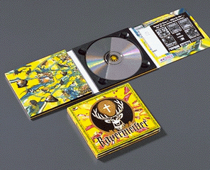 This is what an 8 page digipak looks like.
Uploading Video Update
It is taking long to upload our final video. We started uploading about 15 minutes ago and still no time of finishing soon. Bear with us and it will be done in it's own time.
Just to let you know we are on the shortlist for blog of the week.
Just to let you know we are on the shortlist for blog of the week.
Reaction To Peer review
We were a bit shocked when we received some of the feedback. Particularly the contradictory nature of it (ie. Lack of variety and consistently different?). We agreed with the lyrics relating to the song, such as the leaves falling part. We tried to get quite a bit relating to the song. We represented the genre quite well with our costumes etc. but the swearing was in the song and the spitting was not planned as Josh b just happened to walk past and cough as we were filming.
We were happy with the live performance and the crowd part, but were not sure what was meant by bringing it together at the end. But it does give it another aspect. We are not sure that people will be offended by the swearing and it was in the song already. The reference to ganja was very minimal as there is a small symbol on Josh B's medallion at the start of the video.
Overall we are happy with our video but the second part of it would have been better if we had had time to add effects to it. It was all a bit rushed on the last day.
Thanks to Ricky for Quicktiming after the lesson.
We were happy with the live performance and the crowd part, but were not sure what was meant by bringing it together at the end. But it does give it another aspect. We are not sure that people will be offended by the swearing and it was in the song already. The reference to ganja was very minimal as there is a small symbol on Josh B's medallion at the start of the video.
Overall we are happy with our video but the second part of it would have been better if we had had time to add effects to it. It was all a bit rushed on the last day.
Thanks to Ricky for Quicktiming after the lesson.
Peer Goodwin Analysis
- Its consistently different which relates to the song
- The lyrics often relate to the visual representations of the song, for example, the leaf shot
- The stereotypes of that genre are well represented; hoodies, trainers, shades, spitting, swearing
- There is good live performance but it could be brought together a bit better towards the end
- There is a notion of voyeurism; the sunglasses
- The live performance gives another aspect
- The lack of variety makes the audience lose interest; doesn't change pace
- People may be offended by swearing, spitting and ganja references
- There are no inter-textual references
-
- The lyrics often relate to the visual representations of the song, for example, the leaf shot
- The stereotypes of that genre are well represented; hoodies, trainers, shades, spitting, swearing
- There is good live performance but it could be brought together a bit better towards the end
- There is a notion of voyeurism; the sunglasses
- The live performance gives another aspect
- The lack of variety makes the audience lose interest; doesn't change pace
- People may be offended by swearing, spitting and ganja references
- There are no inter-textual references
-